

I was embedded within the Beamly product team to assist on the creation and management of a new design system, component library, and web platform for the Coty Group.
Coty’s family of beauty brands spans a broad spectrum of catalogue size, brand maturity, creative asset availability, and target demographic. Common features were that all brands provide beauty and fragrance products, and are integrated with ChannelAdvisor, which directs consumers to purchase via sites such as Amazon.
The scope of the project was focused on providing the brands with stable, responsive and accessible websites, and reinventing design and usability standards across Coty’s portfolio of brands.
Before this project started, six Coty brand sites were already built using a legacy platform. The others ran their own platforms but none were aligned or maintained cohesive design standards. We needed to efficiently provide Coty’s beauty and fragrance brands with a web presence, whilst optimising brand sites to increase engagement and conversion.
The current systems in no way empowered brands to manage their content. Coty had no single source of truth for existing Coty brands or digital standards, causing discrepancies in quality and consistency across the Group. It was imperative to improve productivity for designers and developers across the brands.
To provide Coty’s beauty Brands with stable, responsive and accessible websites. Any solution would need to be flexible and easy to personalise to reflect the brand’s offering.
We prioritised improving the front and back-end experience for all of the platform’s users (internal, brand teams and the end consumer), whilst also taking into account the business need to make the site creation process more efficient and for the platform to integrate seamlessly with Coty’s product management database and digital asset management system.
As a designer on the product team, I created and maintained standards for the Design System and consumer platform. My responsibilities ranged from being one of three core designers responsible for creating UX and UI patterns, guidelines and standards for the system, as well as championing it’s progression and usage to brands and C-level executives. I was embedded in initiatives such as product strategy and feature priority and creating workshops for Coty’s portfolio of brands to adopt and rebuild their sites with a new brand expression.
Information Gathering
We reviewed various style guides, legacy system oracles, Confluence pages, and Sketch files as a base. Through in-person interviews, we collected feedback from brand managers, content editors, designers, developers, and beauty experts to highlight pain points and define a clear strategy for addressing them.
Designers highlighted inefficiency in designing common patterns from scratch with limited visibility of existing patterns, and developers commented that it was time-consuming to build and maintain different patterns for each site. Both found it difficult to know which of a project’s files, inevitably all named ‘final’, should be worked from, and the lack of a shared nomenclature often led to confusion over breakpoints and functionality expectations.
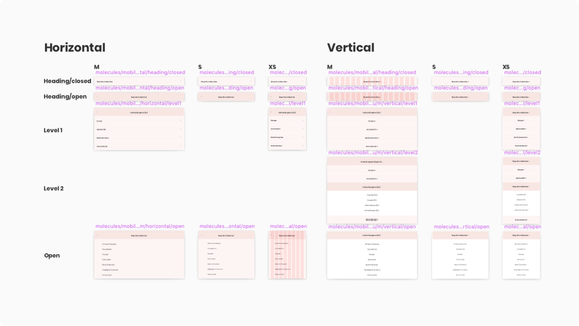
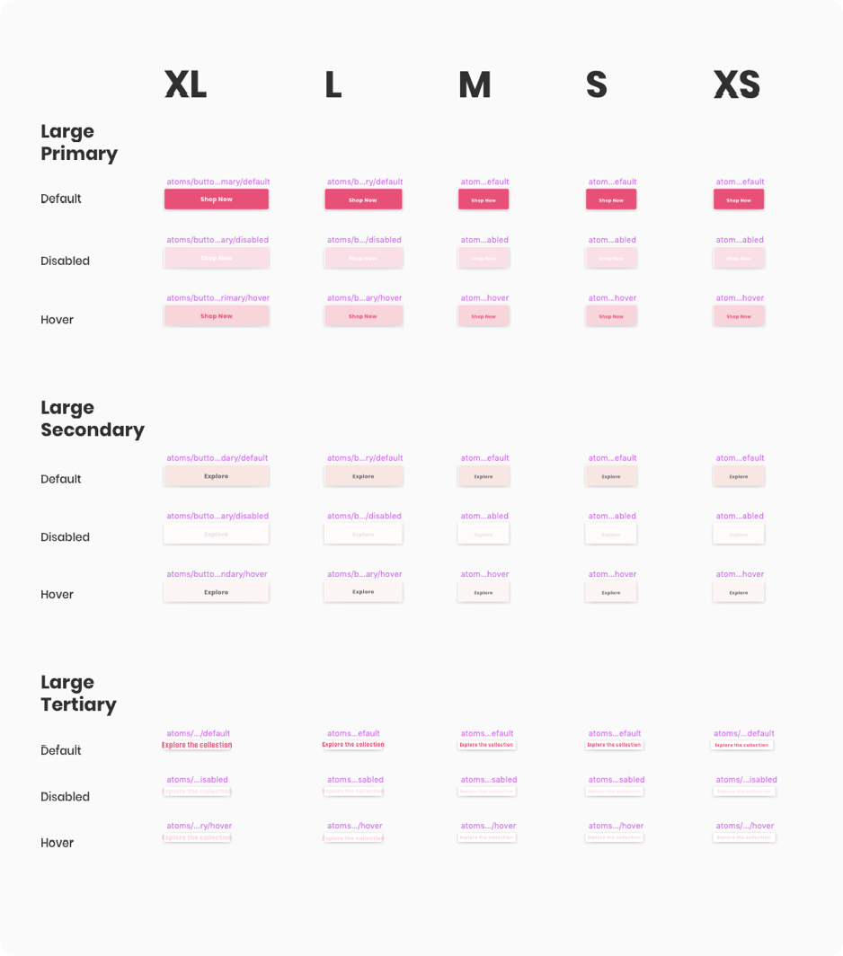
Brands wanted unique and modern sites which reflected their creative direction, along with the ability to publish and edit their content to support product launches and campaigns. To enable this, designers and developers needed to have component variants available for each site to have its own look and feel, and consistency in design and code for easier maintenance and management of design standards.
The approach
Workshops were ran with the wider product team to define the technologies and tools that would improve workflow, design processes and the developer handover process.
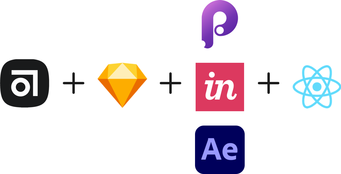
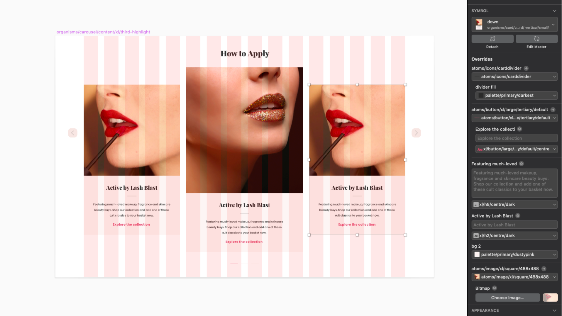
Sketch was decided on after some experimentation with other industry leaders. Sketch files were accessed through Abstract to manage duplication of symbols and file versioning. This allowed for shared component libraries and a single source of truth in the design workflow.
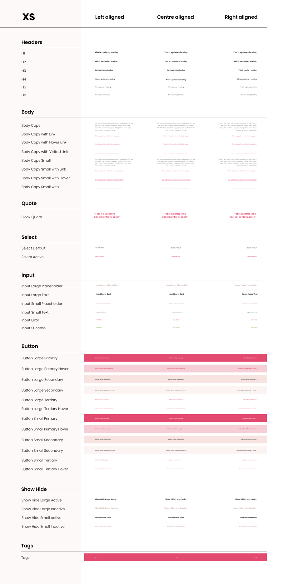
An eight point grid system was adopted with sixteen columns on XL/L breakpoints and eight as browsers and devices reduce in width. This allowed for more interesting layouts whilst introducing consistency and rhythm across products and avoiding the rendering issues associated with scaling and half pixels.
A common design mindset
Atomic Design was selected as the organisational frame for the system. The development team adopting React as their JavaScript library also helped us to align, as all teams where thinking about the project in terms of creating complex interfaces from small building blocks.
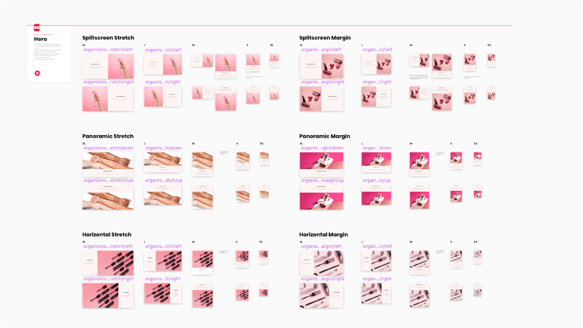
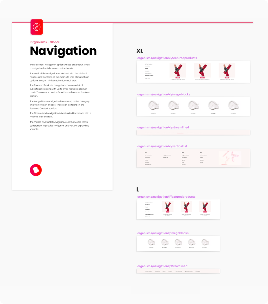
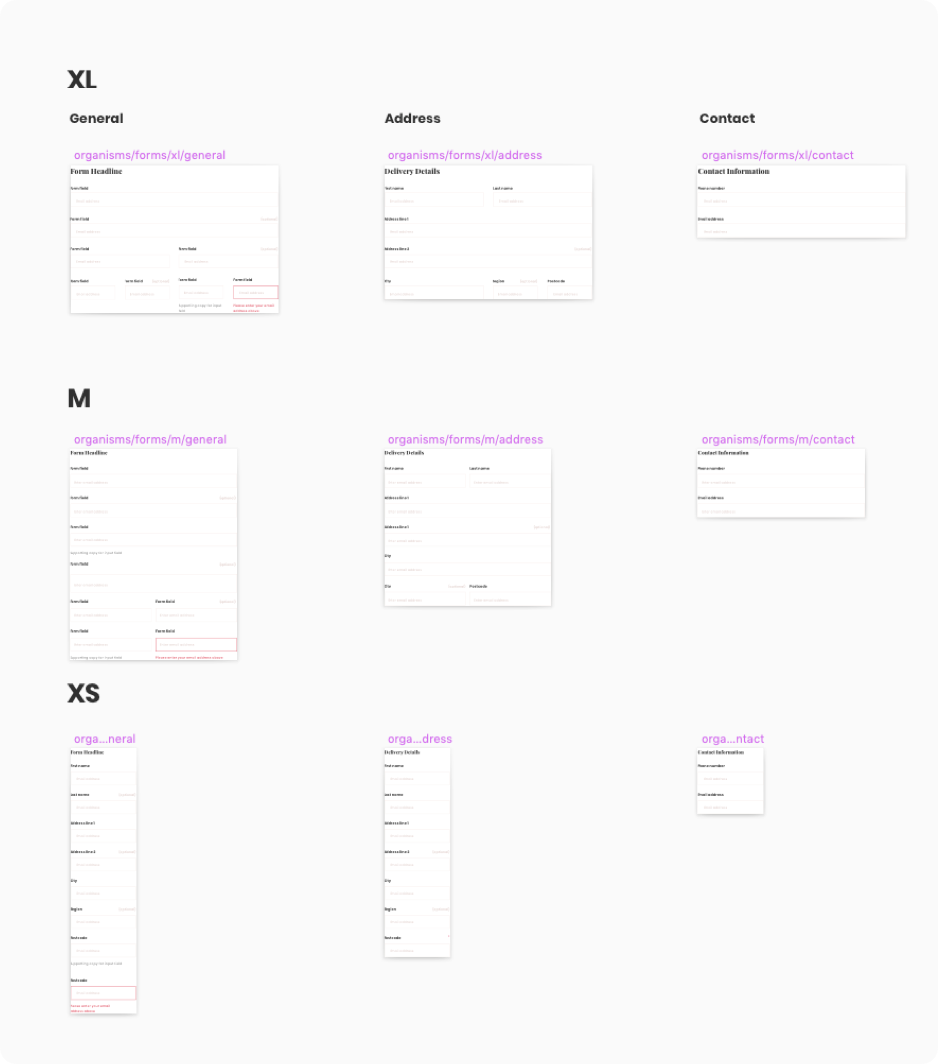
Based on the research findings, a list of priority components (such a global components needed by every site) was generated. This was followed by brand-specific requests. Multiple variations of each component were then define, sketched out, and user tested. These had to be suitable for varying sizes of product catalogue, target demographic, number of creative assets, and amount of editorial content each brand had access too.
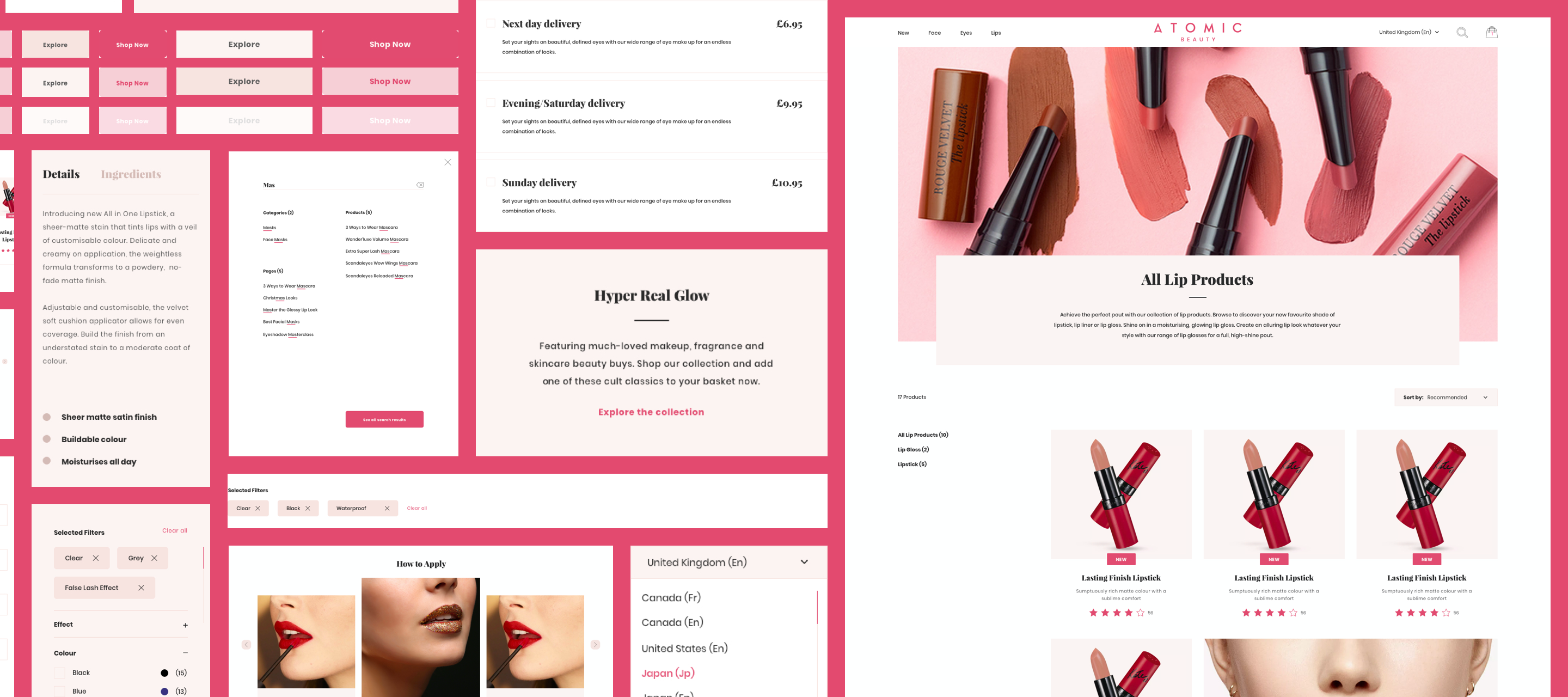
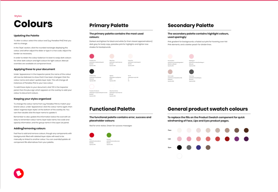
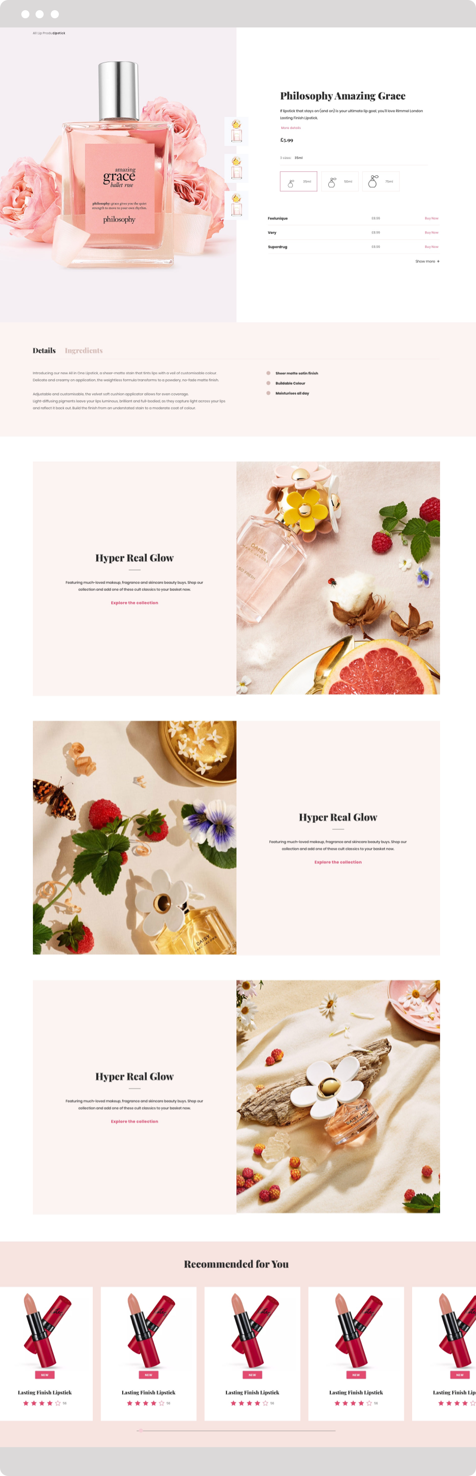
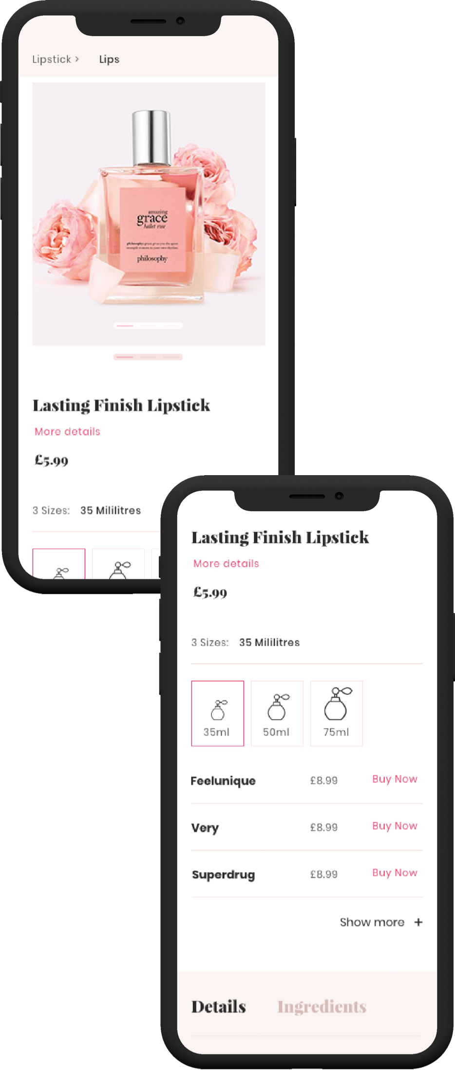
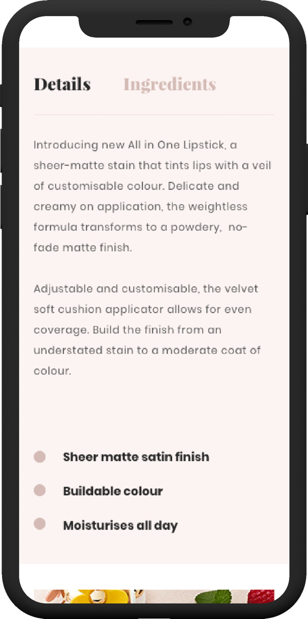
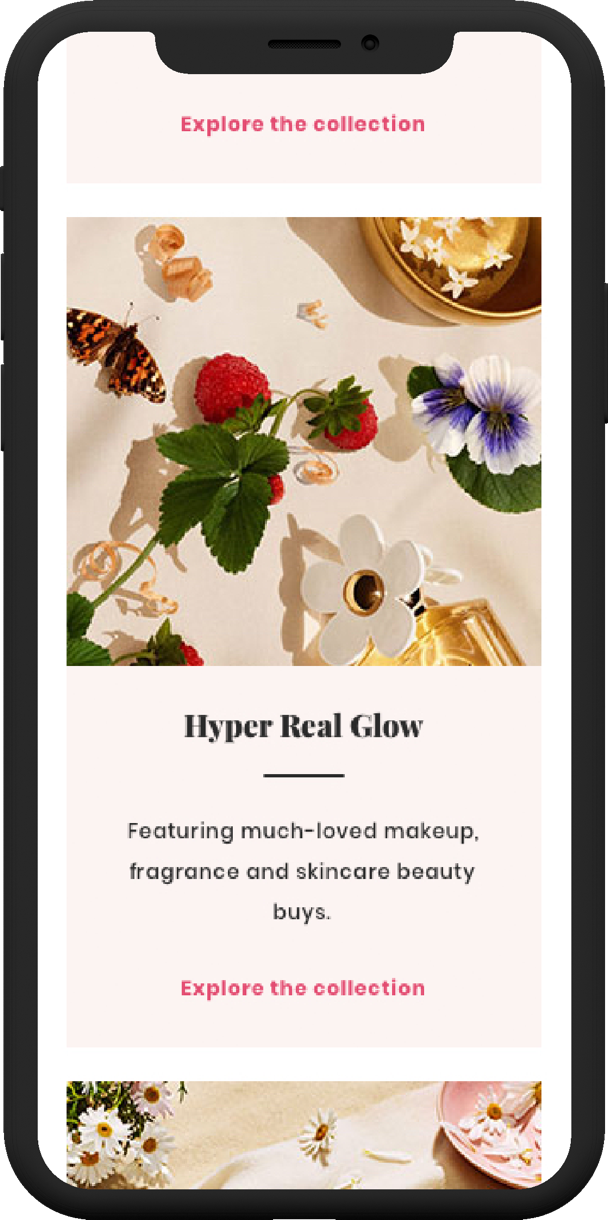
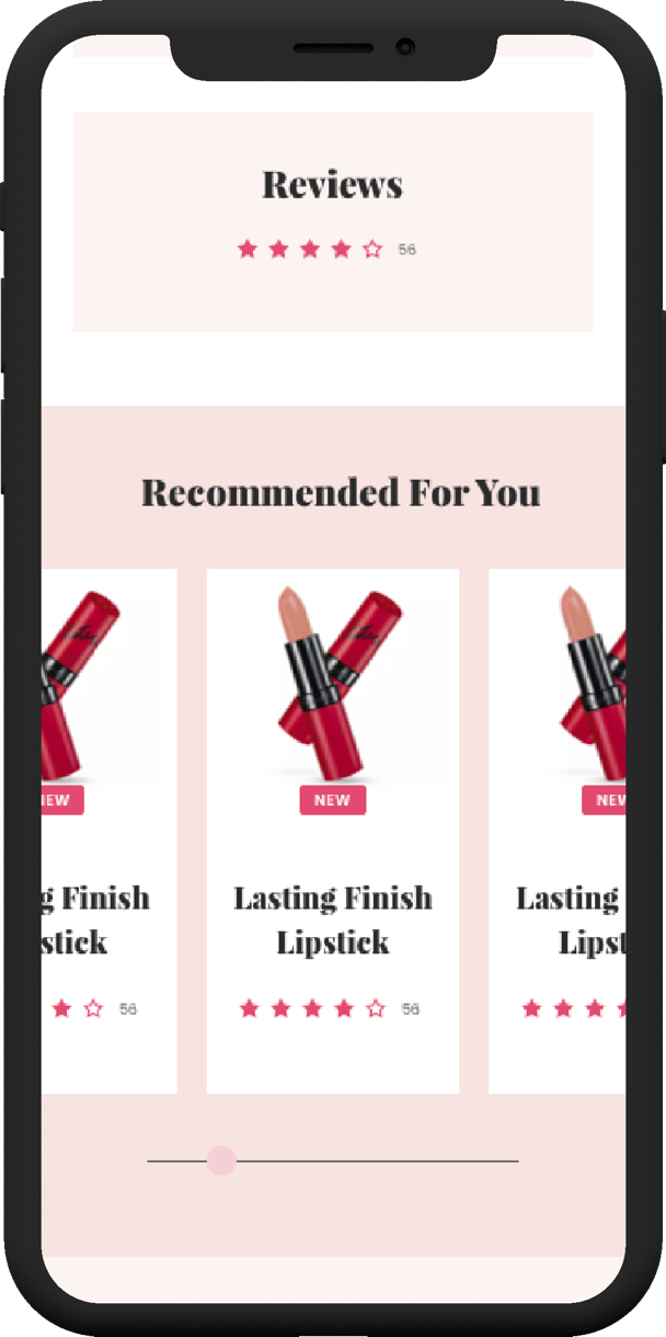
Components were tailored for consumer beauty retail. For example, multiple carousel styles were included for product recommendations. Colour styles for lip, face, eye, and nail product swatches were prioritised for quick product page mock-ups and ‘how to apply’ templates suitable for different products and looks.
Responsive Assets
Feedback on the existing brands informed us that both users and designers deemed the sites static. Even if transitions and animations were in the design phase, they were often left to the last minute and relegated to the backlog due to time constraints.
Not all brands were digitally mature enough to have in-house design teams available or the budget to include custom assets. Several families of responsive animated SVG icons and component transitions, suitable for different tones of voice, were created to address this. These would be available out-of-the-box, so that a refined product could be produced even on a tight budget and deadline.

Rapid Wireframing
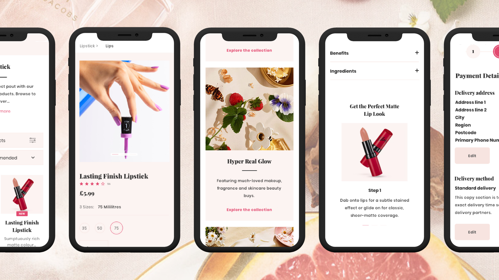
Using wireframes for user testing and presenting journeys to clients had not been especially successful in the past. Clients found it difficult to visualise how wireframes would be transformed into branded sites. During in-person interviews clients often complained that low-fidelity prototypes didn’t match their expectations of a beauty site. To address this, an in-house cosmetics brand was created, Atomic Beauty.
Creative assets from across the Coty Group were used, enabling the team to create components that visually resembled a beauty brand. This new level of visibility guided brands on the types of assets required to achieve the same level of quality.
Validation and Documentation
Fortnightly user testing sessions on the iterations of components provided insights and data to the product team. We continued testing all iterations using in-person interviews or remotely, via Validately. Collecting data on performance divergence across demographics and devices gave us the ability to advise brands on which components to utilise. This allowed us to verify that components and changes to the design system met business requirements.
Documentation was vital for other internal and external teams to quickly adopt the platform, and work in harmony with the system. The design library is entirely themeable, providing multiple variations of each component, in order to keep the library streamlined and clean, designers could delete versions unsuitable for their brand. Within the UI kit, use cases and design standards were recorded to ensure proper use of the design system. We recognised that each team using the system has its own way of working, including their own shortcuts and plugins. As such, it was deemed important to explain what was fixed, and the risks involved in changing certain aspects.
The design system's guidelines were tailored by the product team and technical writers to keep them succinct and relevant for users.
The end product was tested library of reusable web components, available both as a React and Sketch component library. These libraries have reduced the time taken to wireframe a site with ten-page templates from one week to half a day.
All Coty brands have now been migrated onto the new platform, from which we will be able to gain like-for-like data on KPIs, such as page performance, conversion and performance. Early feedback from content editors was positive, and product owners/designers have reported increased clarity on the design process and feature behaviour.
The new system is also allowing the core product team to rapidly prototype new features and has improved the onboarding process for new designers and developers. The documentation and standards have also streamlined acceptance criteria/developer handover significantly.
If you have a new project, opportunity or are in need of some digital design assistance, I would love to hear from you. Just fill out the form below to get in touch and I’ll get back to you pronto!
If you're interested in following my latest escapades, or are just in the mood for a good old stalk, here are the social channels you will find me on.

